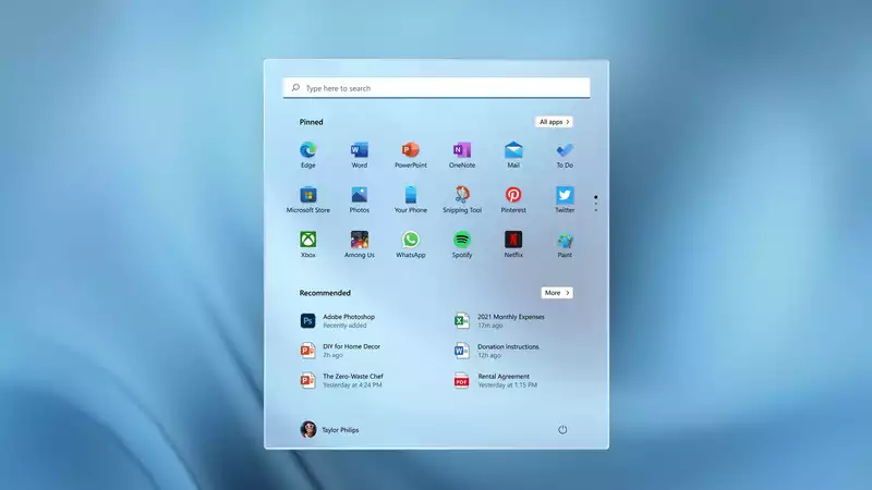
Of all the changes in Windows 11 (currently in release), perhaps the most significant and noticeable is the revamped Start menu With a new home on the taskbar and a redesigned layout of apps and features, Windows 11 has restructured and perhaps improved this integral part of the Microsoft experience
The Start menu is like the master control panel of your PC It's where you find apps not pinned to the desktop or taskbar, and where you can quickly access the settings menu and power controls
Each element of the Start menu may not be as advanced or detailed as needed in a particular situation, but it is a good starting point and provides a quick portal to the tools you need at any given moment
In Windows 11, Microsoft has made significant changes to the Start menu The layout has been changed and the functions included have been streamlined to provide a cleaner and hopefully more intuitive user experience
There is still much to be learned about the new Start menu However, the videos and images from the Microsoft Windows 11 event provide some interesting details to read about what is new, what has changed, and what has not changed in the Start menu
And with this information, you'll understand whether the new Start Menu is something you need right away or something you can wait forNow that Windows 11 is starting to be released, check out our Windows 11 review to learn more about the update Learn more and see if we recommend downloading (or waiting) now
The default position of the Start button is different in Windows 11 than in past versions of Windows Instead of being anchored in the lower left corner of the screen, the Start button and menu are placed in the central portion of the taskbar that runs along the bottom of the screen
If you prefer the left-facing layout, it appears that the Start button can be moved back to that position Also, as before, this menu can be opened by tapping the Windows key
The new Start menu looks much cleaner than before, and moving it from the corner of the screen to the center may bring some interesting improvements, allowing you to navigate more efficiently through the apps and files located there
But with change comes confusion, and until we can actually use the final version of the new Windows 11, the best information about the new Start menu may be the announced image itself
Search Bar
At the top of the Start menu is the search bar It allows you to enter text to search all the apps and files on your machine, as well as pull information from the web and relevant results from the Windows Store
Judging from the details shown in Microsoft's preview video, the search results seem to start popping up as soon as you start typing, with a search results interface that allows you to quickly sort between apps, documents, web results, and other positive hits Appearance
Pinned Apps
The next item is a collection of icons for all pinned apps The fact that this specifies pinned apps should mean that we are looking at a list of frequently used apps curated by the user, not one automatically generated by the system
This change would give more menu space to the specific apps you want to put there, allowing you to perfectly customize the Start menu to suit you and your needs
At the top of this pinned apps menu is an "All Apps" button Past versions of the Start menu had a long scrolling list of all the apps and programs installed on the machine, and this could be a way to access a similar menu in Windows 11
Interestingly, there are three dots next to the pinned app icon panel The position and design of this element, so far unconfirmed, would suggest that it is possible to pin multiple apps and cycle through them with a click
Recommendations
The next large section of the Start menu is labeled "Recommendations" This appears to consist of automatically generated recommendations for the apps and files you are most likely to need
The details of how these items are selected are not publicly available and could be based on anything from frequently used apps to files that are routinely opened at the same time of day
User Accounts
At the bottom of the Start menu is a profile picture showing the active user account Clicking on it will bring up options to sign out, switch users, and lock the system
Power
And at the bottom right of the Start menu is a power icon; if it is like Windows 10, clicking this icon will bring up options to shut down, restart, or put the machine into sleep mode
When Microsoft launched Windows 8 in 2012, it added Live Tiles Live Tiles replaced static app icons with a dynamic grid-like menu of rectangles that could display icons, photos, or real-time information within a particular app Live Tiles remained in Windows 10, with a few tweaks to make it easier to use
However, this real-time feature was removed from the Start menu and reborn as a widget, seemingly bringing the icon back to the Start menu And while the live tiles may be visually interesting, the busy interface they create was not always easy to navigate The automatic configuration of tiles could be confusing, and the dynamic aspect of the tiles made for a very visually cluttered menu
According to the Windows 11 specifications, the Start menu also lost the ability to create named groups of apps and folders Pinned apps and sites will not be migrated from Windows 10 upon upgrade, so be prepared to redo some of your customizations
Also interestingly, the new Start menu is not resizable Menu and icon sizing may be an important accessibility feature to be added in the future





Comments