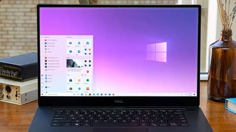
Windows 10's new Start menu has been redesigned and is loaded with Microsoft's sophisticated Fluent design language, but it takes some doing to really get the new tiles and other tricks
The sleeker Start menu, released in Windows 10 build 20161, is apparently part of some A/B testing But there is a workaround that can get it on your PC right now
Microsoft explains that the refreshed Start menu provides a "more streamlined design" by applying a "uniform, partially transparent background to the tiles" instead of a solid-color background Of course, third-party Windows applications still have largely contrasting tiles, as we saw with Netflix
To get Windows 10 20161 today, you'll have to live with a bit of risk, as you'll have to put your PC through the Windows Insider Dev cycle This is a cycle to test features as early as possible, so you expose yourself to more bugs than anyone else And this is the story of Windows 10, which needs no help in exposing users to more bugs
The system will reboot
You should now see the new Start menu To check, open the Start menu and look for the tiles for Windows programs like Office If the background of these programs is plain and contrasts strongly with the "Start" menu, then the new "Start" menu is visible
If you do not see the new Start menu here, there is a reason for that: according to Windows United, Microsoft is A/B testing the new Start menu and offers the following workaround
The only problem with this advice is that it is a bit of an expert-level project because it uses the command line and third-party utilities We did not need to use this trick as we got the correct start menu without it


Comments